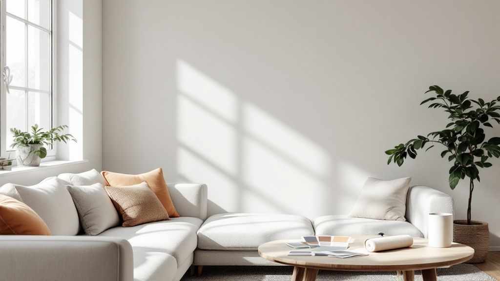
Choosing the right light grey paint for your living room feels a bit like choosing the perfect backdrop for a portrait. This adaptable neutral sets a serene stage, making everything from sleek sofas to cherished heirlooms stand out. Whether you favour pared-back modernity or a snug, country-style nest, light grey blends effortlessly.
Why Light Grey Is a Timeless Choice
Light grey isn’t just a fleeting trend in UK homes. Think of it as a well-primed canvas, poised to showcase your personality without ever overwhelming it. There’s a gentle calm in its undertone—almost like sinking into your favourite armchair at day’s end.
“A soft grey backdrop can transform even the narrowest living space into a tranquil retreat.”
When you choose a lighter shade, you invite both daylight and lamp glow to dance around the room. That extra reflection tricks the eye, making compact corners feel airy and dusky spaces come alive.
The Benefits Of Choosing Light Grey
- Creates a Calming Atmosphere: Soft grey tones quiet visual clutter, encouraging rest and reflection.
- Enhances Natural Light: Every sunbeam or lamp glow seems to stretch further against pale grey walls.
- Adapts To Any Style: From bold jewel-tone cushions to weathered oak furniture, this neutral pairs without drama.
The choice of a well-liked neutral can even affect your asking price. A UK survey found that nearly 40% of residents would offer less for a home with a poor colour scheme. Learn more about how paint choices impact home value from this detailed report.
Decoding the Secret Language of Grey Undertones
Ever wondered why one light grey paint feels cosy and inviting in a living room, while another seems crisp and modern? The secret is all in the undertone—that subtle hint of colour hiding just beneath the surface. It’s a bit like adding a pinch of a specific spice to a recipe; it completely changes the final flavour.
This hidden colour is what gives each grey its unique personality, nudging it towards one of three distinct families. Once you get the hang of these, you’ll be able to choose a shade with confidence, rather than just crossing your fingers and hoping for the best.
The Three Main Undertone Families
Navigating the world of grey paint is so much simpler once you can spot its underlying character. Each type creates a completely different atmosphere in your living space.
- Warm Greys: These shades have hints of yellow, beige, or red, which is how we get the much-loved ‘greige’. They feel incredibly welcoming and are just perfect for creating a snug, comfortable living room, especially when you pair them with natural wood and creamy whites.
- Cool Greys: With undertones of blue, purple, or even green, these greys feel airy, clean, and contemporary. They’re a fantastic choice for modern spaces and look stunning next to sharp whites, metals, and bold accent colours for a really sophisticated look.
- True Neutral Greys: These are the most balanced of the bunch, with no obvious warm or cool leanings. A true grey is a pure, versatile backdrop that works with almost any colour scheme you can dream up, giving your decor a classic and timeless foundation.
Choosing a paint colour is less about what you want to see and more about listening to what your home needs. A grey's undertone has to harmonise with your flooring, furniture, and lighting to create a truly cohesive feel.
To help you visualise this, I've put together a quick guide.
Comparing Light Grey Paint Undertones
This little table is a handy reference to help you identify and choose the right undertone for the atmosphere you're trying to create in your living room.
Remember, the best way to spot these undertones is to compare your paint swatches against a pure white piece of paper. This simple trick makes those hidden yellow, blue, or green hues much easier to see.
For a bit more inspiration, why not have a look at our other paint colour ideas for your living room?
How to Pick the Perfect Grey for Your Room's Lighting
So, you’ve got a handle on undertones. That’s the first hurdle cleared. But the real test for any light grey paint comes down to one thing: natural light.
Think of your room’s light as the director of a play, and the paint colour as the lead actor. It’s the light that dictates how that colour performs on the stage of your walls. A grey you adored in the shop can look completely different once you get it home, all because of the way the light hits it.
This is precisely why that stunning warm grey from a sunny, south-facing living room on Pinterest might fall flat and feel a bit drab in your cooler, north-facing space. The direction and quality of the light will either bring out a grey's cosy, warm notes or highlight its crisp, cooler side.
Match Your Grey to Your Room's Light
To save yourself the heartache of a paint-colour mismatch, you need to work with your room, not against it. It's all about listening to what the space needs.
Here’s a quick cheat sheet to get you started:
- North-Facing Rooms: These rooms get a cool, blue-ish light for most of the day. To stop your space from feeling chilly, you'll want to counteract that with a grey that has warm undertones – think 'greige'. It adds instant cosiness.
- South-Facing Rooms: Ah, the dream! These rooms are bathed in bright, warm light, which means they can handle pretty much any grey you throw at them. In fact, a cooler grey with hints of blue or violet can beautifully balance the sun's intensity, creating a really crisp and refreshing vibe.
- East & West-Facing Rooms: These are the chameleons. The light changes dramatically from a cool morning sun to a warm afternoon glow. Your best bet here is a well-balanced, neutral grey that won’t shift too wildly as the day goes on.
And if you're really struggling, our guide on how to brighten a dark room has a few more tricks up its sleeve.
The golden rule? Never, ever make a final decision in the shop. A paint colour only reveals its true character when you see it in your home, with your furniture, and under your light.
The Final Touches Matter
Beyond the light, the finish you choose will also make a huge difference.
A flat matt finish has a gorgeous, velvety look that absorbs light. It’s brilliant for giving walls a soft, modern feel and is very forgiving when it comes to hiding little bumps and imperfections.
On the other hand, an eggshell finish has a very subtle sheen. This means it reflects a little bit of light back into the room and is much more durable and easier to wipe clean – a seriously practical choice for a busy living room.
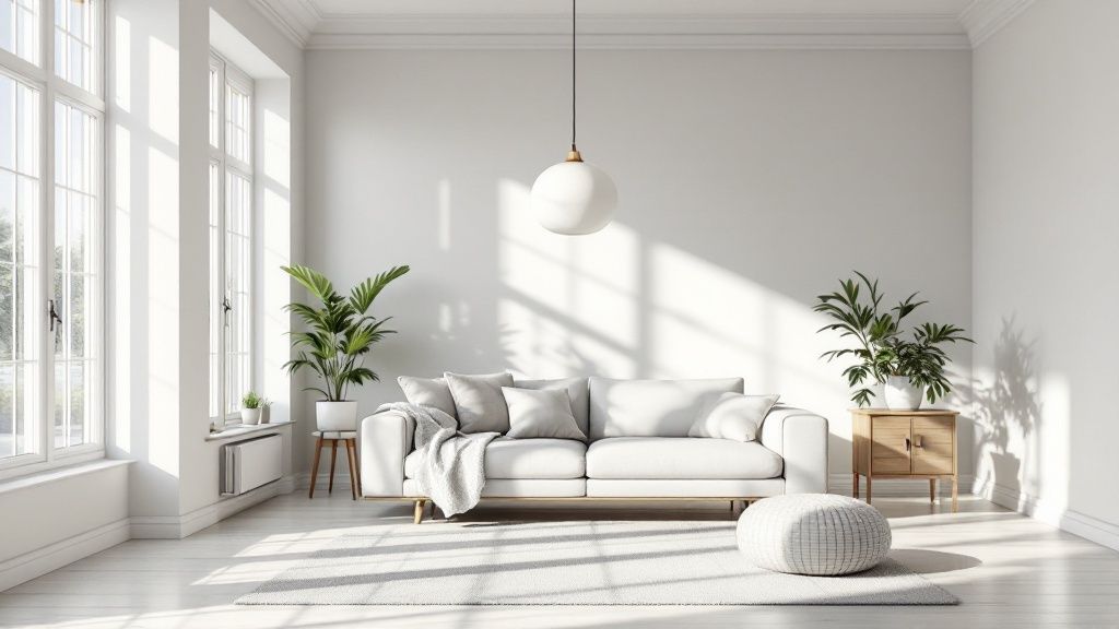
Inspiring Ways to Style Your Light Grey Living Room
So, you’ve picked the perfect light grey paint for your living room. Now for the really fun part: making the space your own. Think of a grey wall as the perfect blank canvas; it’s a classic, understated base that lets all your other design choices truly sing.
This is your chance to show everyone that grey is anything but dull. By layering different textures, colours, and materials, you can create a living room that feels cohesive, stylish, and completely you.
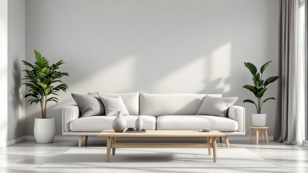
Create a Serene Scandinavian Retreat
If you're dreaming of a calm, airy atmosphere, you can’t go wrong with a Scandinavian-inspired look. This style works beautifully with light grey walls, creating a space that feels clean and cosy, modern yet timeless.
To nail this aesthetic, it’s all about a simple palette built on natural materials and soft, gentle neutrals.
- Bring in Natural Woods: Look for furniture in light-toned woods like oak or ash. A simple coffee table, a sleek sideboard, or even just some wooden picture frames will instantly bring in that essential warmth and texture.
- Layer with White: Crisp white textiles are your best friend here. Think linen curtains that softly filter the light, plush white cushions, and maybe a cosy throw draped over the sofa. This little bit of contrast really makes the grey pop.
- Keep It Minimal: The key to Scandi design is avoiding clutter. Choose furniture with clean, simple lines and give everything room to breathe. The goal is a space that feels uncluttered and peaceful.
Go for Drama with Jewel Tones
Fancy something a bit more luxurious? Try pairing your light grey walls with rich, saturated jewel tones. This creates a stunning, high-contrast look that feels incredibly sophisticated and a little bit dramatic.
The magic is that the neutral grey backdrop stops these deep colours from feeling too much. It grounds them. You could bring in an emerald green velvet armchair, some sapphire blue cushions, or a gorgeous piece of art with flashes of ruby red.
To really elevate this opulent vibe, add some metallic details. A few touches of brass or gold—a lamp, a mirror, or a decorative tray—will catch the light beautifully and add that final touch of glamour.
The real beauty of a light grey canvas is its ability to balance out bold choices. It stops vibrant colours from feeling chaotic and instead makes them look incredibly elegant.
And if you want to create this high-impact look without a huge spend, have a look at some tips for affordable interior design to help you find those perfect statement pieces.
Our Favourite Light Grey Paints For UK Homes
Feeling a bit lost in a sea of paint swatches? We get it. The choice can be overwhelming. So, we've done the legwork and pulled together a few of our absolute favourite light grey paints from brands we know and trust.
Think of this as your expert-approved shortlist. We’re not just giving you names; we're giving you the personality behind each pot of paint – its unique undertones, the light it loves, and the kind of atmosphere it helps create.
Farrow & Ball's Ammonite
If you're after a modern classic, look no further. Ammonite is one of the softest, lightest greys out there. It has this incredible warmth that never, ever veers into beige territory, keeping things feeling fresh and calm. It’s the perfect, understated choice for creating a serene backdrop, especially in rooms that get a decent amount of natural light.
Little Greene's French Grey
Don't let the name fool you. French Grey is a wonderfully complex neutral with just a whisper of a green undertone. This little hint of green gives it a natural, earthy feel that almost brings a bit of the outdoors in. It’s one of those rare colours that works beautifully in both traditional and contemporary homes, creating a space that feels both sophisticated and deeply restful.
Consider these paints not just as colours, but as moods waiting to be brought to life on your walls.
Dulux's Polished Pebble
For something a bit cooler and more contemporary, Polished Pebble is a brilliant choice. It’s a clean, true grey that feels crisp and airy, making it fantastic for brightening up a room. We especially love this shade for modern, minimalist living rooms where you want a sharp, uncluttered look. It looks absolutely stunning paired with a brilliant white trim.
Finding the perfect shade is all part of the fun, and our guide to living room colour ideas is packed with even more inspiration to get you started.
A Few Common Questions About Light Grey Living Rooms
So, you're thinking about painting your living room a beautiful light grey? It's a fantastic choice, but it's completely normal to have a few questions buzzing around your head before you commit. We get it.
To help clear up any last-minute wobbles, we’ve put together answers to the most common queries we hear.
Think of this as your final checklist for making sure your decorating project is a roaring success from the very first brushstroke.
Will a Light Grey Living Room Feel Cold?
This is probably the number one worry we see, but the short answer is no—not if you choose your grey wisely! The trick is all in the undertone.
To sidestep that chilly, sterile feeling (especially in north-facing rooms that get cooler light), you’ll want to look for a warm grey. These are often called 'greige' because they have subtle hints of yellow or beige that instantly make a space feel more inviting and snug.
Adding plenty of texture is another brilliant way to dial up the warmth. For more on this, our guide on how to make a room cosy is packed with simple, effective tips.
What Colours Go Best with Light Grey Walls?
This is the best part! Light grey is a decorator's dream because it's so incredibly versatile. It acts as the perfect neutral backdrop, letting you play with a whole spectrum of other colours.
Here are a few combinations that always work a treat:
- For a calm, serene vibe: Try pairing light grey with soft pastels like a dusty blush pink, a gentle sage green, or a muted powder blue.
- For a bit of drama: Create a bold, sophisticated look by contrasting it with rich jewel tones. Think deep navy, emerald green, or a moody burgundy.
- For a timeless, classic feel: You simply can't go wrong with crisp white, sharp black, and the natural warmth of wood tones.
What’s the Best Paint Finish for a Living Room?
In a busy space like the living room, you need a paint that looks good but can also handle real life. That's why an eggshell or a durable matt finish is almost always the best bet.
An eggshell finish has a delicate, low-sheen look that’s tough enough to resist scuffs and easy to wipe clean. A good durable matt, on the other hand, gives you that contemporary, completely flat look but is specially made to be much more resilient and wipeable than standard matt paint.